Three new features just landed in Kyomi: built-in forecasting, multi-source charts, and PDF export. Forecast your metrics with confidence intervals, combine data from multiple databases in a single chart, and export dashboards as professional PDFs — all without leaving the platform.
Forecast Your Metrics — No Python Required
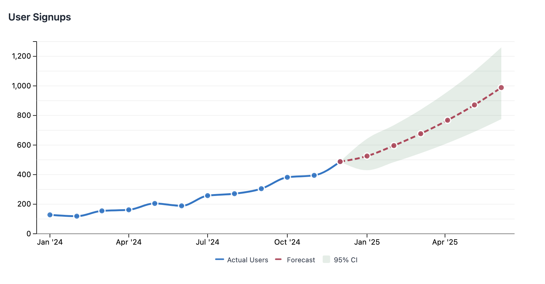
Ask "what will revenue be next quarter?" and get a chart with forecasts and confidence bands. No notebooks, no pandas, no matplotlib.
Under the hood, Kyomi uses QuackStats — a DuckDB extension we built for time series forecasting. It provides a forecast() SQL function that handles model selection, fitting, and prediction intervals — all in a single query. We're planning to open source it.
The AI picks the right model automatically, or you can choose from exponential, logistic, linear, or ETS (exponential smoothing with trend and seasonality). The auto mode cross-validates all candidate models and selects the best fit.
Here's what the ChartML looks like under the hood:
data:
  revenue:
    datasource: "production-postgres"
    query: |
      SELECT sale_date::date as date, SUM(revenue) as revenue
      FROM sales.transactions
      WHERE sale_date >= '2024-01-01'
      GROUP BY 1 ORDER BY 1

transform:
  forecast:
    timestamp: date
    value: revenue
    horizon: 6

visualize:
  type: line
  columns: date
  rows:
    - field: revenue
      label: "Actual Revenue"
    - field: forecast
      label: "Forecast"
      lineStyle: dashed
    - mark: range
      upper: upper_bound
      lower: lower_bound
      label: "95% Confidence"
      opacity: 0.15
The forecast() function needs a minimum of 4 data points and outputs a point forecast plus upper and lower prediction bounds. The first output row is the last historical observation, so the forecast line connects seamlessly to actuals with no visual gap.
The AI can also reason about forecast numbers directly. Ask "what will revenue be next quarter?" and get a prose answer like "revenue is projected to reach $142k by July, with a 95% confidence range of $128k–$156k." Combined with Kyomi Watch, forecasting becomes proactive — set up a watch like "alert me if projected revenue drops below $100k" and get notified before it happens.
Forecasting is available on all tiers — Free, Starter, Pro, and Team.
Combine Data From Multiple Databases in One Chart
Real businesses don't keep all their data in one database. Sales might be in PostgreSQL, marketing spend in BigQuery, and product analytics in ClickHouse. Until now, combining them meant exporting CSVs and joining in a spreadsheet.
With multi-source charts, you name your data sources and join them in aggregate SQL:
data:
  sales:
    datasource: "production-postgres"
    query: |
      SELECT month, SUM(revenue) as revenue
      FROM orders GROUP BY month
  marketing:
    datasource: "analytics-bigquery"
    query: |
      SELECT month, SUM(spend) as ad_spend
      FROM campaigns GROUP BY month

transform:
  sql: |
    SELECT s.month, s.revenue, m.ad_spend,
           s.revenue / m.ad_spend as roas
    FROM {sales} s
    JOIN {marketing} m USING (month)
    ORDER BY s.month
Each named source runs against its own datasource, and the results are joined locally in DuckDB. No data copying between databases, no ETL pipeline to maintain.
New Chart Enhancements
Two new visualization features make forecast charts (and any chart) more expressive:
Dashed and dotted lines — Set lineStyle: dashed or lineStyle: dotted on any line series to visually distinguish forecast from actuals, targets from benchmarks, or any conceptual difference between series.
Confidence bands — Use mark: range with upper and lower fields to render a shaded area between two bounds. Combined with transparency (opacity: 0.15), this creates the classic confidence interval visualization that statisticians expect.
These work together to create professional forecast visualizations where solid lines show what happened, dashed lines show what's predicted, and shaded bands show the uncertainty.
Export Dashboards as PDF
Stakeholders who don't log in still need to see your dashboards. Board members, investors, partners — they want a clean document, not a login page.
Click Download PDF in any dashboard viewer and get a professional A4 document with:
- High-resolution charts — crisp text and lines, not blurry screenshots
- Clean formatting — proper page breaks, page numbers, and consistent layout
- All chart features — forecasts, confidence bands, multi-source charts, annotations — everything renders in the PDF exactly as it appears on screen
No more screenshotting charts into PowerPoint slides. Build the dashboard once, export whenever you need to share.
PDF export is available on Pro and Team plans.
Get Started
These features are live now for all Kyomi users. Sign in and try asking about future trends in your data — the AI will use forecasting automatically when appropriate.
If you're new to Kyomi, start free with AI included. No credit card required.
Kyomi is a data intelligence platform that connects to your warehouse and answers questions in plain English. Learn more about what it can do.